Theme File Structure
A theme file in ADITO defines a visual identity through color variables. Each variable represents a color value that is reused across multiple UI elements. Changing one value affects all components associated with it. Understanding these dependencies is key to maintaining a visually consistent and accessible theme. Follow the design Guideline for optimal results.
Core Color Variables
The following color variables are available for configuration:
Main Color 1
This is the primary signal color and reflects the dominant corporate color. In ADITO’s standard theme, this is a blue tone.
Requirements
- Must be clearly visible on both light and dark backgrounds
- Should be vibrant and attention-grabbing
Application Areas
- Create button background
- Icon color for general buttons
- Global Menu button font and icon
- Link color for system objects
- Highlight color for selected rows (e.g., in timelines)
Main Color 2
This is the secondary signal color and complements Main Color 1. In the standard theme, it is used for the burger button and notification elements.
Requirements
- Should contrast and complement Main Color 1
- Must be visually expressive
Application Areas
- Background of the burger button
- Notification counter background and highlight
Primary Accent Color
This soft color is used as the background for primary interactive elements such as buttons and selected rows.
Application Areas
- Button background
- Background of selected row entries
Note: The login button color cannot be changed independently.
Secondary Accent Color
This very soft color is used primarily in table backgrounds.
Requirements
- Must provide minimal contrast to Main Color 1
- Must still be distinguishable from the primary accent color to ensure row clarity
Application Areas
- Table row backgrounds
Color Palette
The color palette provides a set of up to 20 user-defined colors used in various interface areas.
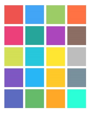
Requirements
- Choose at least 5 colors
- All colors must be visually distinct, especially when adjacent
Application Areas
- Diagram elements
- Avatars
ViewTemplateType-Specific Colors
Certain ViewTemplateTypes use predefined color constants set by the ADITO core. These can be overridden in a custom theme.
Example:
The ResourceTimeline uses constants such as neon.RESOURCETIMELINE_ACTIVE_COLOR_7.
Refer to chapter ResourceTimeline's sub-chapter Color configuration for details.
Summary
Use the checklist below as a quick reference to ensure theme consistency and compliance with the visual design Guideline.
General Principles
- Use color purposefully and with restraint
- Avoid using color alone to encode information
- Prevent problematic color combinations
- Account for users with color vision deficiencies
- Ensure sufficient contrast (minimum 4.5:1 for text)
Specific Requirements
- Main Color 1: Strong and visible on light/dark backgrounds
- Main Color 2: Strong, ideally complementary to Main Color 1
- Primary Accent Color: Must meet contrast requirements against Main Color 1
- Secondary Accent Color: Must also contrast sufficiently from Main Color 1
- Color Palette: Use 5–20 strong, distinguishable colors