Custom Theme
If you do not provide color values, we can extract them from publicly available sources such as your website or brand portal.
What You Need to Provide for a Custom Theme
To create a custom theme, we require specific color information depending on your selected configuration.
Summary of Required Inputs
| Color Set | Required Colors | Usage Areas |
|---|---|---|
| Main Colors | 1 Main Color 1 Secondary Color | Core visual identity for UI elements such as buttons, highlights, menus |
| User Colors | 5–20 Custom Colors | Extended colors for diagrams, avatars, scorecards; must be clearly distinguishable |
Furthermore, the customer can provide a background image and a company logo, both to be used for the Login-/Logout web page.
Main Colors
- Main Color 1: The dominant branding color.
- Main Color 2: A contrasting color used for highlights and accents.
These two core colors define the overall visual identity of the theme and should reflect your branding.
User Colors
- UserColors: A set of up to 20 distinct colors used across various UI components.
These colors are used to enhance visual differentiation in areas such as diagrams, avatars, and scorecards. All colors should be visually distinct from one another and should avoid ambiguity when viewed together. If neccessary, ADITO will extend the set with matching supplementary colors to ensure a complete and balanced palette.
The Primary and Secondary Accent Colors are not required from the customer. These colors are always defined by ADITO as part of the theme design to ensure optimal contrast, readability, and alignment with the system layout.
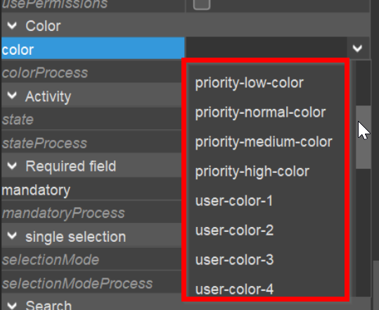
Overview
You can view the available colors defined by the Theme if, e.g., you open the combo box of any color property (e.g., the color property of an EntityField).