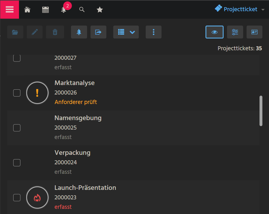
CardTable
The CardTable ViewTemplate presents multiple datasets in a vertically arranged list, with each item displayed in the format of an individual card. The visual layout and configuration of each card within the list follow the same principles as the Card ViewTemplate. This makes CardTable particularly suitable for overviews or result lists where compact but informative representations of multiple records are required.
Layout and Behavior
Each dataset in the CardTable is rendered using the card layout known from the Card ViewTemplate. This means that each item can include:
- An image or icon on the left side (
iconField) - Text fields for title, subtitle, and description on the right side
- Optional Action buttons
- An optional labeled
informationField
The cards are stacked vertically, enabling users to scroll through and interact with multiple entries efficiently.
Usage Context
Example Implementation
An example implementation is the ViewTemplate CardTable, used in the view ProjectticketFilter_New_view.
The configuration and appearance of each card within the CardTable are derived from the same field mappings used in the standard Card ViewTemplate, such as titleField, subtitleField, descriptionField, and informationField.