Icons
Well-selected icons support a good orientation and a precise navigation, both in the client and in the Designer.
There are platform-defined icons, which cannot be customized. In particular, these are
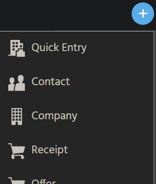
- all permanently available icons in the "Global Bar", at the top of the client, e.g., the icons of "Home button", "Favorite" button, "Quickentry" button, etc. (changing the icon properties of the related models has no effect);
- all "general" icons, which appear at predefined positions in every ViewTemplate, e.g., the "pencil" icon for identifying the "edit" button, or the "garbage can" icon of the "delete" button);
- the icons of the filter component, e.g., the blue buttons for saving a new filter and for applying a filter;
- some special cases, like the icons beside the ViewTemplates' titles that are shown when you click on the ViewTemplate selection button, provided by a GroupLayout.
All other icons of an ADITO project can be customized. These will be explained in the following chapters.
Some (already deployed) icon settings in the Designer will not become effective unless you logout and re-login to the client. In particular, this is true for most of the icons that are not related to a specific Context.
Position
In the client, customizable icons appear as features of
- a menu group of the Global Menu
- a Context/Entity
- an EditView, to be shown in the "Quickentry" menu
- an Action or ActionGroup
- a Dashlet, both in the DashletStore and on a Dashboard
- an EntityField, to be shown individually per record (dataset)
In the Designer, specific elements of the project tree have customizable icons, to be shown in the "Projects" window and in the "Navigator" window. Example: An "at" icon appears beside BulkMail_entity (module bulkmail):.
Wherever a client icon is defined as mandatory by the platform, but none is set, a question mark ("?") is displayed as fallback.
Find further information in the following chapters.
Properties
The following properties can be used for customizing icons that will then be shown in specific positions:
iconandiconProcessiconIdandiconIdProcessimageandimageProcess
How many of these properties are available depends on the model: An Entity, e.g., has all of the above properties, while an Action has only iconId and iconIdProcess.
- EntityFields with property
contentTypeset to "IMAGE" can also be used for showing icons, which are selectable by the client user and can be defined by logic as well.
Find further explanations in the following chapters.
Icon variants
Icons can be configured in multiple variants:
-
ADITO provides you with a large number of predefined icons.
- These are selectable from identical comboboxes of the properties
icon,iconId, andimage;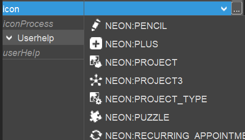
- Their names can be used in the
resultof the propertiesiconProcess,iconIdProcess, andimageProcess. Example:result.string("VAADIN:TASKS")
- These are selectable from identical comboboxes of the properties
-
Specific strings that encode Avatars can also be passed in the
resultof thexxxProcessproperties. Avatars are often used as fallback, if a real image is not available.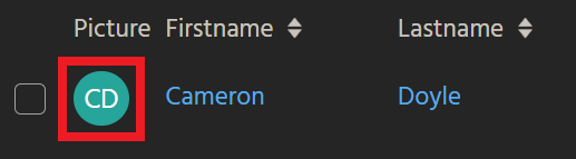
-
The customizer can configure arbitrary images to be used as icons by passing them as base64 encoded string in the
resultof thexxxProcessproperties. -
Some properties (particularly
imageandicon) show a three dot button on the right. This button opens a file chooser for selecting an arbitrary external image file. WARNING: This option is currently not effective, as the Transpiler cannot handle it. (#2063619) -
EntityFields having the
contentType"IMAGE":- The client user can select an arbitrary external image to be used as icon, via a FileChooser.
- The customizer can use the EntityField's
valueProcessordisplayValueProcessin order to set icons dynamically. Theresultoptions are the same as foriconIdProcessandimageProcess(see chapter Entity icons).
Configuration
Entity icons
The Entity is the only model that has all 6 icon-related properties. Therefore, it will be explained first. This is how to use the properties:
-
iconoffers a combobox for selecting an icon from a large list of predefined icons. The selected icon will be- shown in the project tree of the Designer, to the left of the Entity's name
- used as fallback for the client, if
iconId(see below) is not set
-
iconProcessis no longer used. -
iconIdhas the same combobox asicon, but it is shown in the client, identifying the related Context. It is located to the left of the Entity'stitle, shown-
on top of the FilterView, the EditView, and the MainView;
-
in the sidebar, which can be opened via the "Burger button".
If property
iconIdis not set, propertyicon(see above) will be used as fallback. -
-
iconIdProcessis dynamically calculated per record (dataset), enabling you to show different icons according to different conditions. Theresultcan be- the textual representation of a predefined icon (e.g., "VAADIN:TASKS"), see the content of the combobox of property
iconId - an arbitrary icon as base64 encoded string
- a string encoding an Avatar
- the textual representation of a predefined icon (e.g., "VAADIN:TASKS"), see the content of the combobox of property
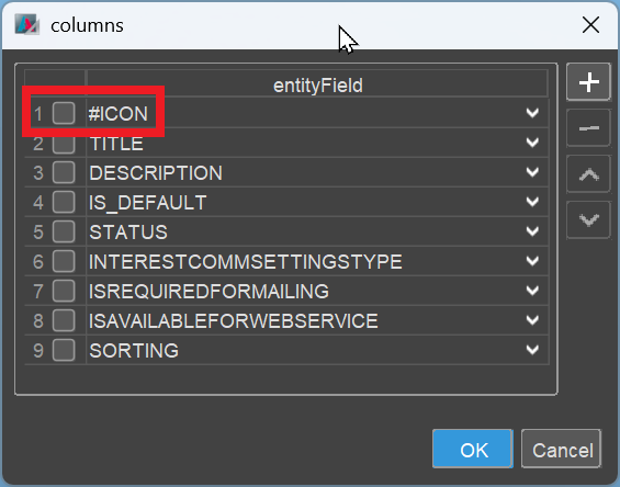
In the ViewTemplates (properties columns, fields, iconField, etc.) you reference the result of the iconIdProcess via selecting "#ICON" from the respective combobox.
image: Image representation of a record (predefined images, selectable via combobox). This property will seldomly be used, as the image will be the same for every single record, when being referenced via "#IMAGE" in the ViewTemplate.
imageProcess: Same purpose and usage as iconIdProcess (see above), with the only difference that you reference its result via selecting "#IMAGE" from the respective combobox.
EditView icons
Whenever an EditView is referenced in the "Quickentry" menu (i.e., the EditView's property quickEntry is set), it is mandatory to set also the EditView's property icon. (Property iconProcess is not used here.)
Normally, this should be the same icon that is set in the related Enitity's property iconId.
Menu group icons
After you have created a new menu group, you need to assign a suitable icon:
- In the menu editor, click on the name of the menu group.
- In the menu group's property sheet, select a suitable icon from property
icon. (PropertyiconProcessis not used here.)
Action/ActionGroup icons
The models Action and ActionGroup allow the setting of an icon, which will be shown on the Action button - either alone or beside the title (depending on the Action's configuration):

There are the following icon-related properties:
iconIdallows you to select a static icon from a large list of predefined icons.iconIdProcessallows you to set a predefined icon dynamically, i.e., you can write logic in order to show different icons, depending on the selected dataset, or on day/time, or on some other condition. This property overrides propertyiconId. Generally, you should use only the predefined icons here. Technically, you can also use base64 encoded icons, but this is not recommended, with respect to a uniform, consistent design. Avatars cannot be used, as they are not properly scaled.
Dashlet icons
The icon of a Dashlet is set in property icon of the respective DashletConfig(uration). It is then displayed both in the corresponding selection item in the DashletStore and in the Dashlet's title bar on the Dashboard.
Other than the Dashlet's title, the icon of a Dashlet (on a Dashboard) will be updated, if you change it in the corresponding DashletConfig. (after deploy and logout/login)
Property iconProcess is not used here.
EntityField icons
As already mentioned in chapter Icon variants, an EntityField can also be used to show icons, individually per record. Prerequisite is taht the EntityField's property contentType is set to option "IMAGE".
Where the icon appears, depends on the ViewTemplate settings. Examples: Icons can be shown
- in a column of a TableViewTemplate and/or
- in the
iconFieldof a CardViewTemplate.
The icon can be set by the client user as well as by a customizable logic:
- The client user can select an arbitrary external image to be used as icon of a specific record, via a FileChooser, which is automatically provided in edit mode:
 ->
->
- The customizer can use the EntityField's
valueProcessordisplayValueProcessin order to set icons dynamically. Theresultoptions are the same as foriconIdProcessandimageProcess(see chapter Entity icons).
In practice, a combination of both is often used:
- First, the logic checks, if an icon has been selected by the user or is available in the database field of the record. If so, this icon is displayed.
- If not, then a static placeholder or a record-specific Avatar is shown as fallback.
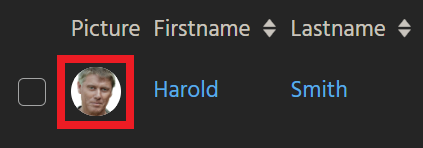
Here is an example of the field PICTURE of Person_entity (module contact):
import { neon, result, vars  } from "@aditosoftware/jdito-types";
import { $ContactManagementKeywords } from "ContactManagementKeywords_registry";

if (vars.get("$sys.recordstate") == neon.OPERATINGSTATE_VIEW)
{
    if (vars.get("$field.STATUS") == $ContactManagementKeywords.contactStatus$inactive())
    {
        result.string("VAADIN:CLOSE_BIG");
    }
    else
    {
        if (vars.get("$field.PICTURE"))
        {
            result.string(vars.get("$field.PICTURE"));
        }
        else
        {
            result.string(
                "TEXT:" + (vars.getString("$field.FIRSTNAME")
                    + " "
                    + vars.getString("$field.LASTNAME")
                    + " "
                    + vars.getString("$field.ORGANISATION_ID.displayValue")).trim()
            );
        }
    }
}
Filtering for a suitable icon
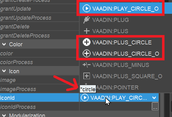
As for the properties icon, iconId, and image: You can quickly find a suitable icon, if you filter the combobox using the starlet ("*") as preceding wildcard, because this skips the prefixes "VAADIN:" and "NEON:".
Example: You are looking for an icon that has something to do with a "circle". To find all possibly suiting icons, proceed as follows:
- Open the combobox by clicking on the small "arrow" to the right: A long list of all icon names, along with a preview of all icons, will appear.
- Type the following string: *circle -> The focus will jump to the first icon with its name containing the word "circle"
- Use your keyboard's arrow keys (down/up) to navigate to all other icons having names containing "circle". (This is better than scanning the whole list using the scroll bar.)
- Press the "Enter" key to select the icon of your choice.
Icons from customizer's resources
All parts of the ADITO xRM project are already equipped with well-suited icons. This ensures a uniform, consistent design of the ADITO client. Therefore, these icons should usually not be changed.
A large collection of predefined icons is available for additional Entities, menu groups, etc. (see above)
Generally, icons provided by ADITO should be preferred. If you nevertheless miss a specific icon that cannot be replaced by one of the predefined icons, you can use an icon from your own resources,
- as base64 encoded string, via a
xxxProcessproperty; - as external image file, selectable via the FileChooser of the three dots button of the combobox properties, to the right of the "open combobox" arrow icon. WARNING: This option is currently not effective, as the Transpiler cannot handle it. (#2063619)
Scaling
ADITO's icons are vector graphics (prefix "VAADIN:xxx") or a font (prefix "NEON:xxx"). This allows an arbitrary scaling/zooming, and the programmer does not have to consider the resolution of the image.
As the client's elements can be zoomed in the browser, there is no absolute size of icons. Currently, icons appear smallest in the Global Menu, and largest in ViewTemplates of type "Tiles".
Animated gif files
Technically, you can also use an animated gif file instead of a static image, e.g., as picture of a contact person, or as background of the client's login page. However, we recommend to use this feature with great care (if at all), as animations generally tend to distract the user's attention from the actual information content shown in the client - and, in most cases, they are of no real additional benefit for the user.